top of page
No Collections Here
Sort your projects into collections. Click on "Manage Collections" to get started
My Portfolio
Welcome to my portfolio. Here you’ll find a selection of my work. Explore my projects to learn more about what I do.


Guillén Group
UX/UI · Visual Design · Prototyping in Figma
Comprehensive redesign project of Guillén Group’s corporate website, focused on enhancing the user experience and evolving the brand’s visual identity within its digital environment.
The main objective was to design a more intuitive, clear and visually driven platform, optimising the information architecture, content hierarchy and navigation flows, while preserving the brand’s essence and core values.
All designs were fully prototyped in Figma, allowing user journeys to be tested, interfaces to be iterated and the overall experience to be validated prior to development.


Blucle
Blucle: a return to origins with a sustainable vision
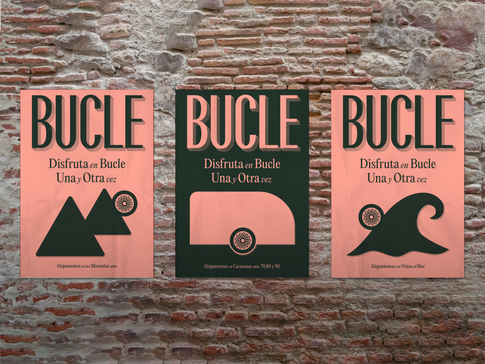
Caravanning, in its most authentic form, is making a strong comeback as a unique way to experience travel and adventure. In this context, Blucle was born — a project based in the Valencian Community that brings the past back to life, reimagined for a more conscious present.
As the name suggests, Blucle is a loop: a thoughtful repetition of what once was, now reshaped with modern values like sustainability, a deep connection with nature, and a taste for authenticity.
I was responsible for creating the entire visual identity and designing the website, carefully crafting each element to reflect this cyclical journey between past and future. From the logo to the digital experience, the brand expresses freedom, minimalism, and a purposeful nomadic lifestyle.
Blucle is more than just a brand — it's a tribute to the past, a reflection of the present, and a step toward a more mindful future.


Fiora Contract
Fiora Contract: This project was developed in collaboration with the agency Idear Ideas and involved the implementation of a specialized landing page for Fiora. The page was designed specifically for a more exclusive audience, including designers, architects, and companies in the contract sector. It features a refined and functional visual approach, aligned with the brand’s premium identity, and aims to strengthen connections with design professionals through a carefully crafted, intuitive, and detail-oriented digital experience.


Iglop
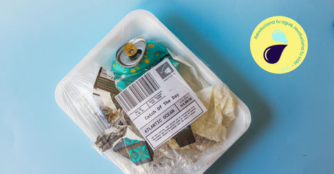
Iglop: For Iglop, a comprehensive project was developed that included naming creation, brand identity design, website development, and social media management. Iglop is a fresh, modern brand committed to sustainability, specializing in reverse osmosis systems for water treatment and purification.
The brand was born with the mission of offering responsible solutions in a world striving to reduce plastic use and promote more conscious consumption habits. From the naming process to the digital communication strategy, every element was carefully crafted to reflect the brand’s core values—conveying a clear, contemporary message aligned with new generations committed to environmental care.
The brand was born with the mission of offering responsible solutions in a world striving to reduce plastic use and promote more conscious consumption habits. From the naming process to the digital communication strategy, every element was carefully crafted to reflect the brand’s core values—conveying a clear, contemporary message aligned with new generations committed to environmental care.


Horno Pizarro
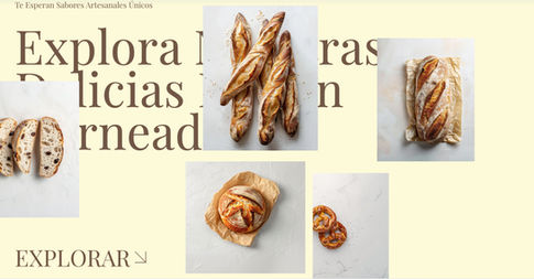
Horno Pizarro: Bakers since 1954, Horno Pizarro is a family-run business passed down through generations, preserving its traditional essence and commitment to artisanal quality. For this project, a new website was designed and developed, integrating online ordering features to enhance the customer experience and streamline the purchasing process.
In addition, the brand’s visual identity was refreshed with a more sophisticated and contemporary style, while maintaining the warm, authentic character that reflects its history and legacy.
In addition, the brand’s visual identity was refreshed with a more sophisticated and contemporary style, while maintaining the warm, authentic character that reflects its history and legacy.


Infinity Pressum
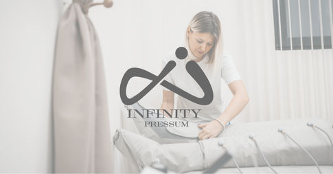
Infinity Pressum: a professional pressotherapy solution developed with a comprehensive approach to design and user experience.
For this project, the complete packaging system was designed, covering everything from visual concept development to final execution, with special attention to visual identity, brand coherence, and packaging functionality. The unboxing experience was carefully crafted to reflect the product’s core values of quality, technology, and well-being, using elements such as custom typography, a harmonized color palette, and premium print finishes—including laminates, varnishes, and strategically placed die-cuts.
For this project, the complete packaging system was designed, covering everything from visual concept development to final execution, with special attention to visual identity, brand coherence, and packaging functionality. The unboxing experience was carefully crafted to reflect the product’s core values of quality, technology, and well-being, using elements such as custom typography, a harmonized color palette, and premium print finishes—including laminates, varnishes, and strategically placed die-cuts.
bottom of page